
Learn why mobile-first design improves user experience, SEO performance, and overall website success.
Why Mobile-First Design Is Essential for Modern Websites
With the majority of users accessing websites through smartphones, mobile-first design is no longer optional—it’s essential. Businesses that prioritize mobile experiences are better positioned to engage users, improve performance, and stay competitive.
Mobile Users Come First
Today’s users expect websites to load fast, look clean, and function smoothly on mobile devices. If a site feels clunky or hard to navigate on a phone, users are likely to leave instantly.
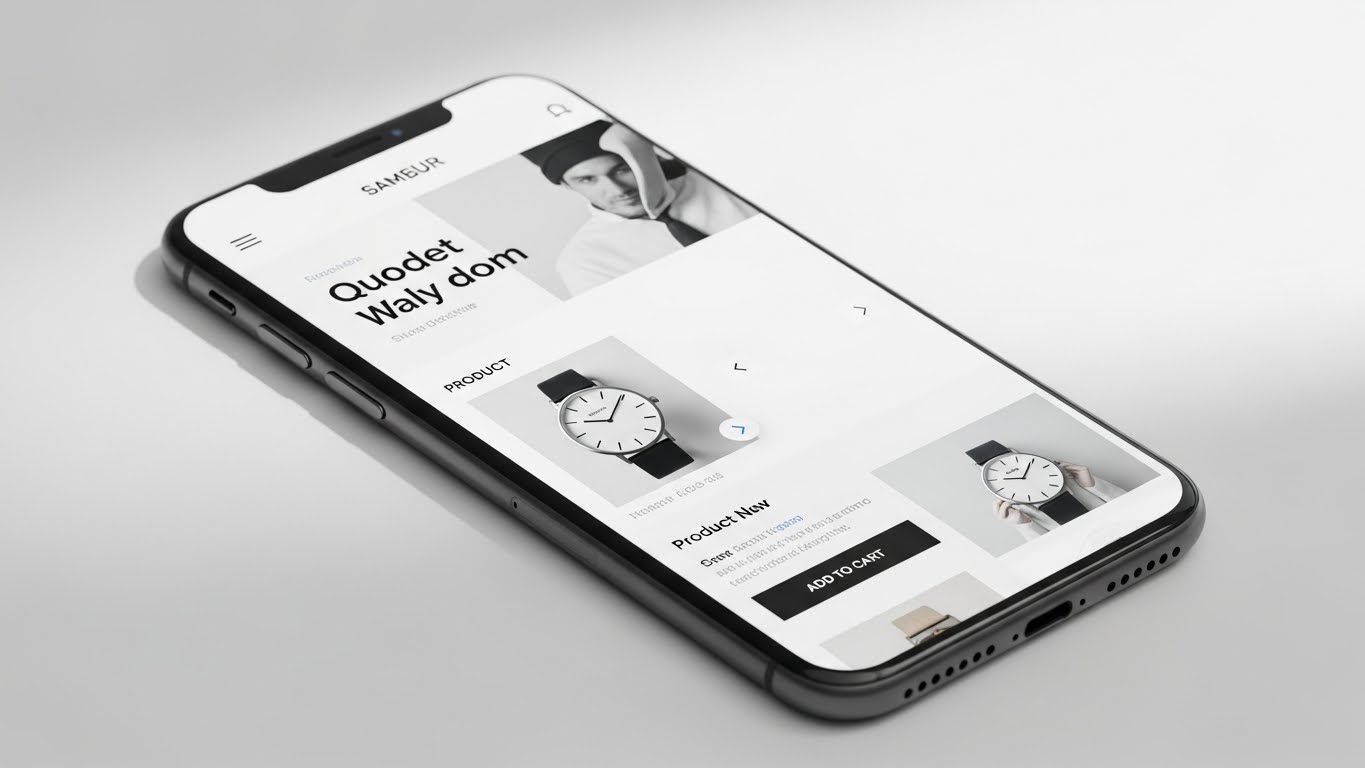
At Pixel Perfect, we design with mobile users in mind from the very beginning.

Better UX, Better Performance
Mobile-first design focuses on simplicity, clarity, and usability. By prioritizing essential content and intuitive navigation, businesses can deliver a smoother user experience across all screen sizes.
Mobile-optimized design helps to:
Reduce bounce rates
Improve page load speed
Increase user engagement
SEO Benefits of Mobile Optimization
Search engines favor mobile-friendly websites. A mobile-first approach improves rankings, visibility, and overall SEO performance, helping your website reach a wider audience.
Consistency Across Devices
Mobile-first design ensures your brand looks consistent and professional whether users visit from a phone, tablet, or desktop. This consistency strengthens trust and brand credibility.
Conclusion
Mobile-first design is a strategic approach that improves usability, performance, and growth. By focusing on mobile experiences, businesses can meet user expectations and drive long-term success.