
Learn why mobile-responsive design is essential for usability, SEO, and digital growth.
Why Mobile-Responsive Design Is No Longer Optional
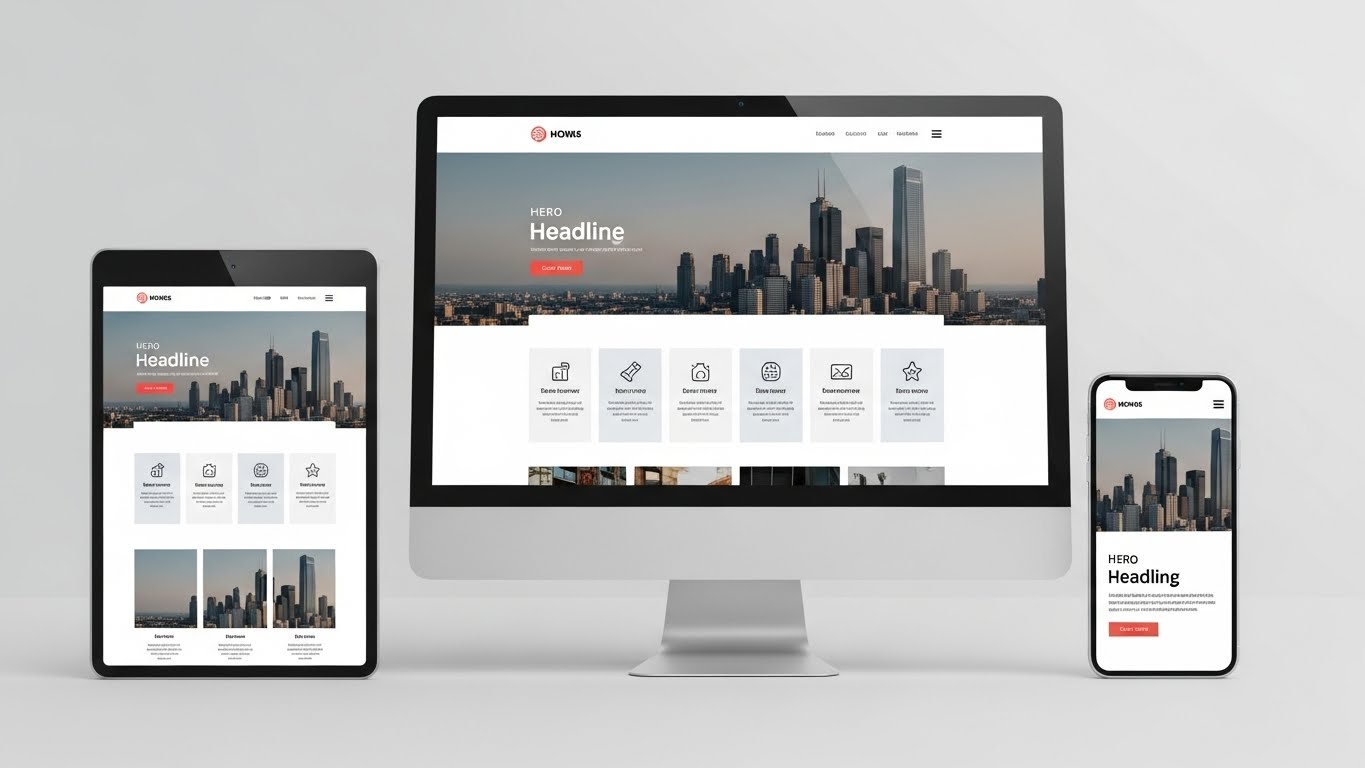
With the majority of users accessing websites through mobile devices, responsive design has become a necessity rather than a luxury. A mobile-responsive website ensures a smooth and consistent experience across all screen sizes.
Mobile Usage Continues to Rise
Smartphones and tablets have transformed how users browse the web. If your website is not optimized for mobile, you risk losing potential customers before they even engage with your content.
At Pixel Perfect, we design websites that adapt seamlessly to every device.

Better Experience, Better Results
Responsive design improves usability by adjusting layouts, text, and visuals to fit different screens. This leads to better engagement, lower bounce rates, and higher conversion potential.
Mobile-responsive design helps to:
Improve user satisfaction
Increase time on site
Support higher conversions
SEO Benefits of Responsive Design
Search engines prioritize mobile-friendly websites. A responsive design improves search rankings and ensures your site meets modern SEO standards.
Mobile optimization directly contributes to better online visibility.
Consistency Across Devices
A responsive website maintains design consistency across desktop, tablet, and mobile. This consistency strengthens brand identity and ensures users receive the same quality experience everywhere.
Conclusion
Mobile-responsive design is essential for reaching and retaining today’s digital audience. By investing in responsive design, businesses can enhance usability, improve SEO, and stay competitive.